Project Scope
Patient mobile app, responsive website, and internal CRM system
Tools
Figma
My Role
Product Designer (End-to-End)
Duration
Course Project: 3 weeks
Design & Refinement: 10 weeks
Blue Flight
Modern dental app that simplifies appointment booking, payments, and patient management.
The Problem
True Smile Dentist relied on a fully manual appointment process. Patients could only book via phone, and staff manually handled scheduling, cancellations, reminders, and payment tracking.
Through stakeholder discussions and operational analysis, we identified four core issues:
For Patients:
- Booking required phone calls during clinic hours
- No transparency on availability or treatment costs
- No self-service for cancellations or rescheduling
- No central place to access treatment plans or receipts
For Staff:
- Limited visibility into revenue trends and appointment analytics
- High administrative workload managing bookings manually
- Repetitive phone interruptions during consultations
- No centralised patient data management
Research
Step 1
Bussiness Goal
The goal of Blue Flight was to design a simple and transparent flight booking experience that reduces stress for travelers.
By removing hidden fees and simplifying the booking process, the platform aims to build trust and long-term customer loyalty. The product also encourages travelers to book directly through the app rather than relying on third-party platforms.
At the same time, the system supports a more efficient travel experience by providing clear booking management, real-time updates, and accessible customer support.
Step 2
Research & Discovery
The research phase focused on understanding the challenges travelers face when booking flights online.
By reviewing existing booking platforms and analyzing common user frustrations, several key insights emerged:
- Travelers want a fast and simple booking process
- Transparent pricing is essential for trust
- Users expect flexibility for cancellations and changes
- Real-time flight updates help reduce uncertainty
- Access to reliable customer support is important during travel disruptions
These insights helped guide the design decisions throughout the project.
Step 3
Defining the Solution Strategy
Instead of just “adding booking,” I designed a dual-sBased on the research, the solution focused on three main principles:
Simplicity
Create a smooth booking flow that allows users to search, compare, and book flights quickly.
Transparency
Ensure clear pricing and policies so users understand exactly what they are paying for.
Control
Allow travelers to easily manage bookings, access tickets, and receive real-time updates directly in the app.
These principles helped shape a flight booking experience that is clear, flexible, and user-focused.
TARGET USERS
The Blue Flight platform was designed for travelers who want a simple, transparent, and flexible way to book and manage flights directly from their mobile devices.
Research highlighted two main user groups who frequently experience frustration with traditional booking platforms.
Leisure Travelers
People who travel occasionally for holidays, family visits, or personal trips. They often look for the best prices, flexible booking options, and an easy way to manage their travel plans without confusion.
Frequent Travelers
Users who travel regularly for business or personal reasons. They value speed, efficiency, and quick access to important flight information, such as boarding times, gate changes, and booking management.
Understanding the needs of these groups helped shape a design that focuses on clarity, transparency, and convenience throughout the travel journey.
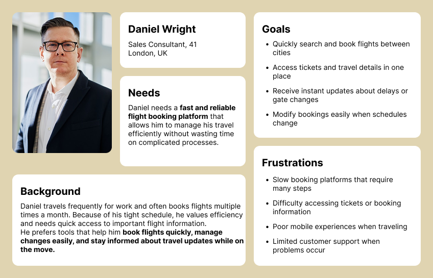
PERSONA #1: THE FREQUENT TRAVELER
Modern travelers expect to manage their trips digitally and value speed, flexibility, and transparency when booking flights. Many travel regularly for work or personal reasons and prefer using mobile apps that allow them to quickly search, book, and manage their flights on the go. Their biggest challenge is dealing with complicated booking platforms, hidden fees, and difficulty making changes to existing reservations. They value clear pricing, fast booking processes, and real-time flight updates that help them stay informed during their journey.
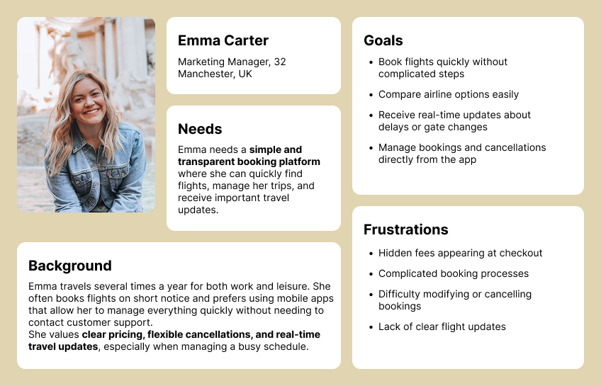
PERSONA #2: THE OCCASIONAL HOLIDAY TRAVELER
Occasional travelers usually book flights for holidays, family visits, or special events. Because they do not book flights often, they may find traditional booking platforms confusing and overwhelming. Their biggest challenge is comparing flights, understanding pricing, and feeling confident that they are choosing the best option. They value simple booking steps, transparent pricing without hidden fees, and helpful notifications that guide them through their travel journey.
Feature Prioritization
To avoid unnecessary complexity and focus on delivering the most valuable functionality first, features were prioritised into three categories: Must-Have (MVP), Should-Have, and Future Enhancements. This approach helped ensure the initial product would solve the most critical user problems while leaving room for future improvements.
MVP Features
These features form the core of the Blue Flight platform and are essential for enabling users to search, book, and manage flights easily.
- Search flights by destination, date, and passenger details
- Compare airlines, prices, and flight durations
- Transparent pricing with no hidden booking fees
- Secure in-app payments
- View and manage active bookings
- Free cancellation up to four days before departure
- Download e-tickets and booking receipts
- Real-time flight updates and notifications
Should-Have Features
These features enhance the overall travel experience and improve convenience for frequent users.
- Saved traveler profiles for faster bookings
- Push notifications for check-in reminders and flight updates
- Access to exclusive deals and discounts
- Multi-language support
- User profile management
Future Enhancements
These features could be introduced in later versions of the product to further improve functionality and personalization.
- Integrated travel insurance options
- Seat selection and in-flight upgrade options
- Loyalty rewards and points system
- AI-powered travel recommendations
- Smart alerts for cheaper flights and price drops
Design Process
After defining the core features and understanding user needs, the next step was to translate these insights into a structured design process. The goal was to create a booking experience that felt simple, transparent, and efficient, reducing the stress often associated with flight planning.
Userflow
Wireframe
UI Design
Testing
Iteration
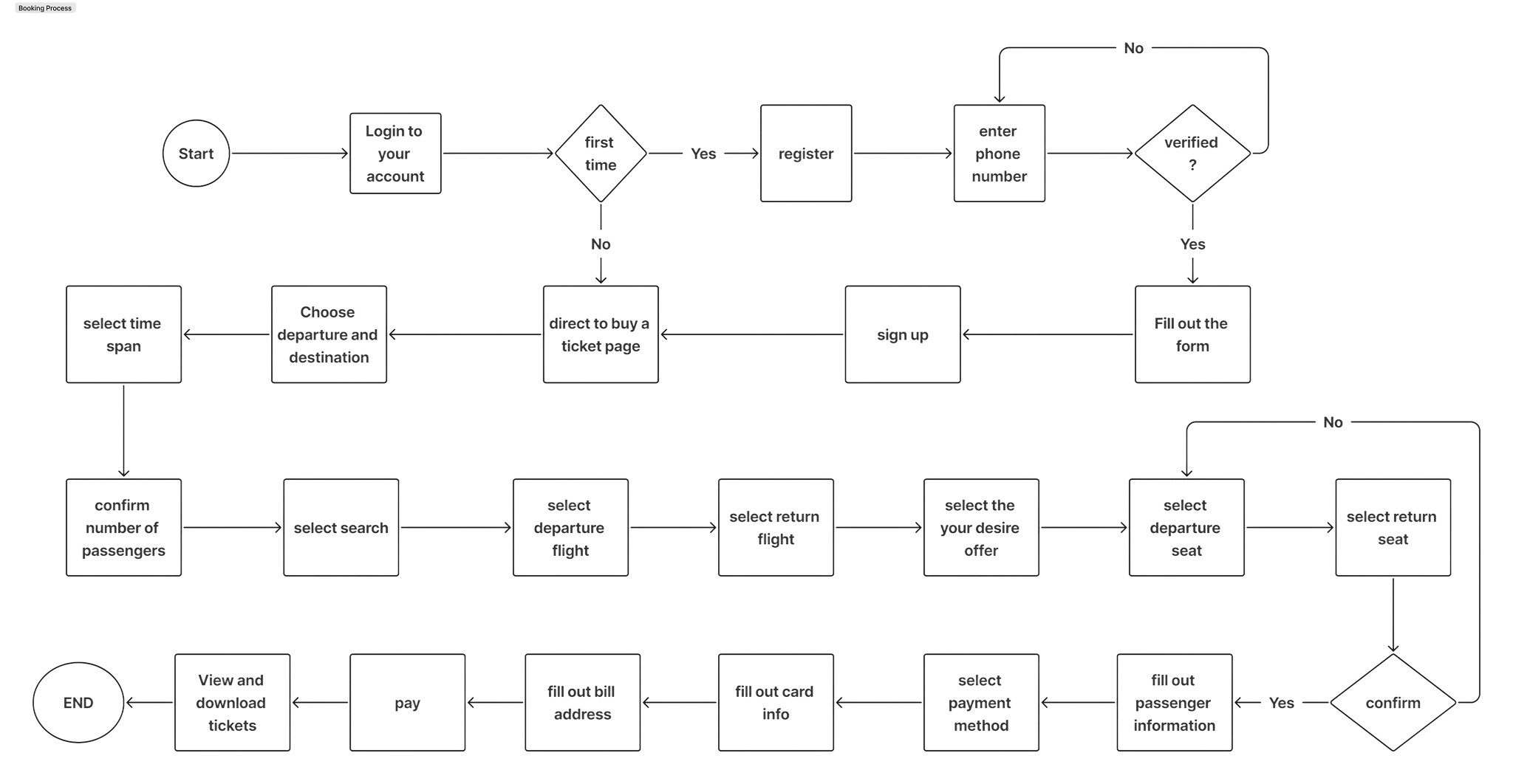
User Flow
To better understand how travelers would interact with the platform, key user journeys were mapped before moving into visual design.
Mapping this process helped identify opportunities to reduce unnecessary steps and simplify decision-making, ensuring users could complete a booking quickly and confidently.
Booking Fight
The primary focus was the flight booking journey, as this is the most critical task users want to accomplish. The flow begins with users searching for flights by entering their destination, travel dates, and passenger details. From there, they can compare available flight options, review pricing details, and select the option that best suits their needs.
Once a flight is selected, users proceed to enter passenger information and complete the booking through secure in-app payment. After confirmation, the booking is stored within the app where users can access tickets, manage their trip, or receive real-time flight updates.
Wireframing
With the user flow established, the next step was to explore layout structures through low-fidelity wireframes.
At this stage, the focus was on content hierarchy and usability rather than visual design. Several layout variations were explored to determine the most intuitive way to present flight search results, airline comparisons, and booking information.
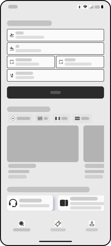
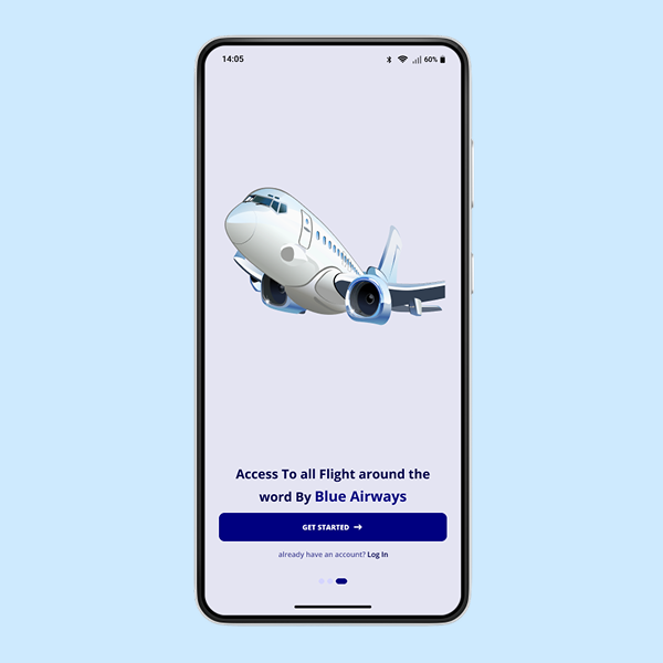
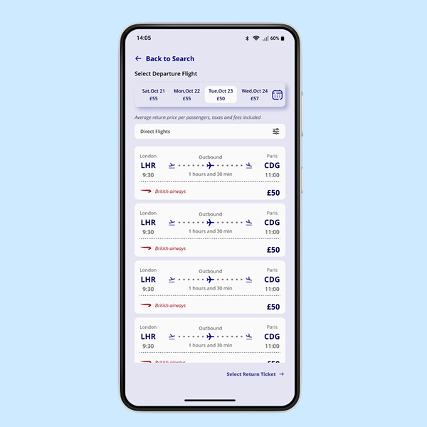
Main Page
Users can enter their departure and destination, select their travel dates, specify the number of passengers, and click Search to see available flight options.
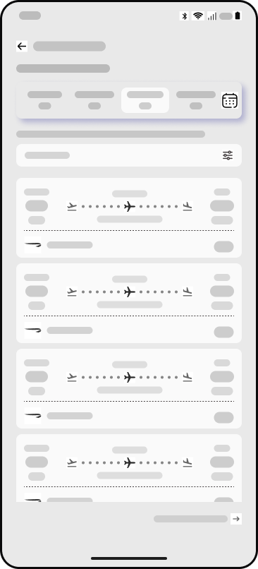
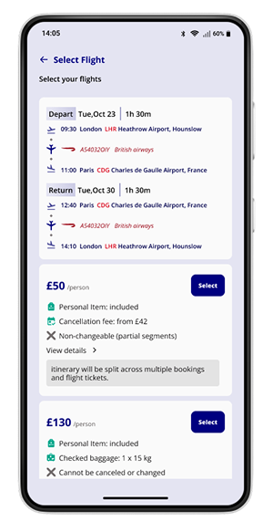
Compare Flights
Users can choose their preferred flight based on departure time, price, and airline.
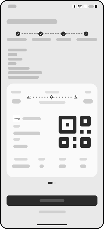
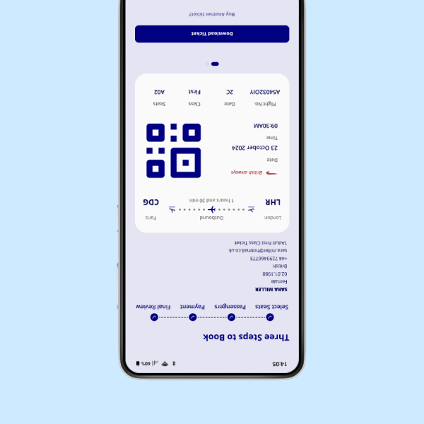
Download Ticket
Passengers can also download their digital ticket and use the QR code for quick and seamless boarding.
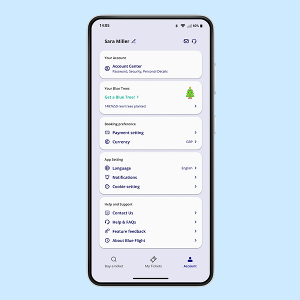
UI Design
After validating the structure through wireframes, the next step was to develop high-fidelity designs that define the visual language of the Blue Flight platform.
The interface was designed to feel clean, modern, and easy to navigate, helping travelers quickly find and book flights without feeling overwhelmed. Clear typography, structured layouts, and consistent spacing help users scan flight options and booking details efficiently.
Bulding the Brand


The colour palette is built around blue tones, which are commonly associated with travel, stability, and trust. Blue is used as the primary colour across the interface to create a calm and professional atmosphere while guiding users toward key actions such as searching flights and confirming bookings.
Lighter shades of blue and neutral colours support the interface by maintaining clarity and readability, ensuring the design remains clean and easy to navigate.
Brand Name
Blue Flight
The brand identity for Blue Flight was designed to reflect the core values of the platform: trust, transparency, and smooth travel experiences.
The name Blue Flight was chosen to evoke the feeling of open skies and freedom of travel. The word Blue connects directly to the sky and aviation, while also representing reliability and calmness. Flight reinforces the product’s purpose, making the brand clear and easy to understand.
Usability Testing
To evaluate the usability of the design, several testing sessions were conducted with participants who regularly book flights online.
Participants were asked to complete key tasks such as searching for flights, comparing airline options, and completing a booking. Observing their interactions helped identify areas where the interface could be improved.
Overall, participants found the flight comparison layout and booking process clear and easy to follow. The simplified steps helped users move from searching to booking without feeling overwhelmed.
During testing, some users mentioned that they wanted clearer visibility of baggage policies and cancellation terms before confirming their booking. In response, these details were made more visible within the booking summary to help users make more informed decisions.
Additionally, several participants expressed the desire to select their seats before arriving at the airport. They explained that choosing seats in advance helps them feel more prepared for their journey and reduces uncertainty during check-in. Based on this feedback, the design considered adding a seat selection option during the booking process, allowing users to choose their preferred seats while completing their reservation.
These insights helped refine the platform to better support traveler expectations and create a smoother booking experience.
View baggage policies and cancellation terms
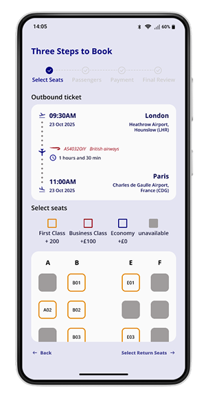
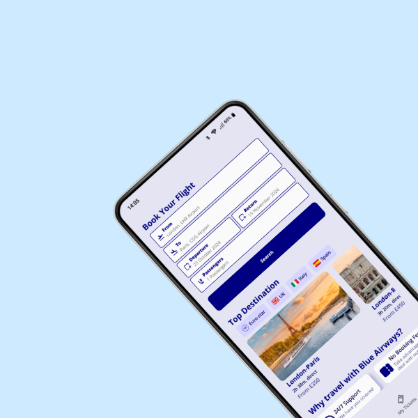
Selecting Seats
Iterations & Refinement
User testing revealed several opportunities to improve the booking experience. Based on participant feedback, a number of refinements were introduced to make the platform clearer and more user-friendly.
IMPROVING PRICING TRANSPARENCY
Some users wanted more clarity around baggage policies and cancellation terms before confirming their booking. To address this, pricing details and policy information were made more visible within the booking summary.
INTRODUCING SEAT SELECTION
Several participants expressed that they would like to select their seats before arriving at the airport. Adding a seat selection option during the booking process allows travelers to feel more prepared and reduces uncertainty during check-in.
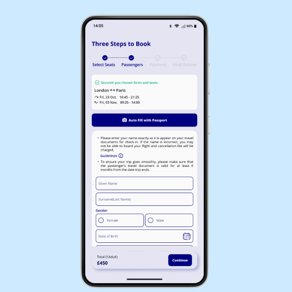
SIMPLIFYING PASSENGER DETAILS
The passenger information form was simplified by reducing unnecessary inputs and improving the layout to help users complete the booking process faster.
These refinements helped create a booking experience that is clearer, more transparent, and better aligned with traveler expectations.
Impact & Potential Value
If implemented, Blue Flight could improve the flight booking experience for both travelers and service providers by simplifying booking and increasing pricing transparency.
For travelers, the platform reduces friction by offering clear pricing, flexible booking management, and real-time flight updates. Features such as simplified booking steps and seat selection during checkout help users feel more prepared and in control of their trips.
For the business, the platform could help build customer trust and loyalty by removing hidden fees and offering a transparent booking process. A smoother user experience may also increase direct bookings, reducing reliance on third-party travel agents.
Overall, Blue Flight demonstrates how thoughtful product design can create a more efficient, transparent, and user-centered travel booking experience.
Takeaways
Designing Blue Flight highlighted how complex travel booking systems can be simplified through thoughtful design decisions.
By focusing on clarity, transparency, and user control, the platform aims to reduce common frustrations travelers face when booking flights online.
User testing played an important role in shaping the final design, revealing opportunities to improve pricing visibility and introduce features such as seat selection during booking.
If the project were developed further, future improvements could include price alerts, personalised travel recommendations, and deeper airline integrations to create an even more seamless travel experience.