Project Scope
Patient mobile app, responsive website, and internal CRM system
My Role
Product Designer (End-to-End)
Duration
4 weeks for the course Project
10 weeks for design
True Smile Dentist
Modern dental app that simplifies appointment booking, payments, and patient management.
The Problem
True Smile Dentist relied on a fully manual appointment process. Patients could only book via phone, and staff manually handled scheduling, cancellations, reminders, and payment tracking.
Through stakeholder discussions and operational analysis, we identified four core issues:
For Patients:
- Booking required phone calls during clinic hours
- No transparency on availability or treatment costs
- No self-service for cancellations or rescheduling
- No central place to access treatment plans or receipts
For Staff:
- Limited visibility into revenue trends and appointment analytics
- High administrative workload managing bookings manually
- Repetitive phone interruptions during consultations
- No centralised patient data management
Research
Step 1
Bussiness Goal
We begin by identifying the goal we want to achieve and then define the main objective:
- Reduce administrative workload
- Increase appointment conversion rate
- Improve patient satisfaction
- Digitise clinic operations
- Enable better tracking of revenue and cancellations
Step 2
Research & Discovery
To ensure that the solutions are realistic, I conducted:
- Stakeholder interviews (clinic owner + receptionist)
- Competitive analysis of dental apps and booking platforms
- User flow mapping for current phone-based booking process
- Heuristic evaluation of similar healthcare platforms
Key Insights
- Patients prefer booking outside clinic hours.
- Staff spend significant time answering repetitive availability questions.
- Cancellations were often unmanaged, creating revenue loss.
- Patients wanted clearer visibility into treatment costs and progress.
Step 3
Defining the Solution Strategy
Instead of just “adding booking,” I designed a dual-system approach:
- Patient-facing app & website
- Internal CRM for operational efficiency
This ensured both sides of the experience improved simultaneously.
TARGET USERS
Through analysing the clinic’s workflow and patient needs, I identified two primary user groups: patients who need a convenient way to manage appointments and clinic staff who handle the operational side of scheduling and patient records.
While both groups interact with the same system, their needs differ significantly. Patients prioritise speed, convenience, and clear communication when booking or managing appointments. In contrast, clinic staff focus on efficiency, organisation, and reducing the time spent on repetitive administrative tasks.
Designing for both users required balancing a simple, self-service experience for patients with a powerful yet easy-to-navigate management system for clinic staff.
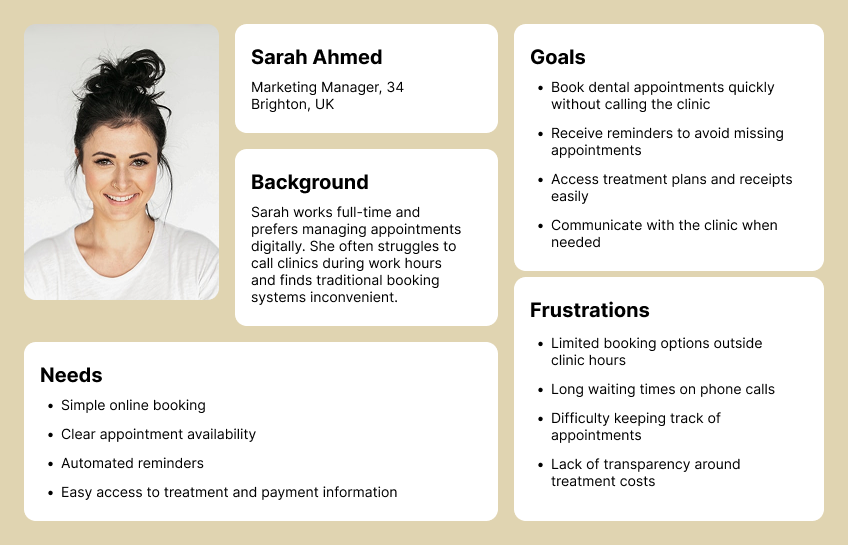
PERSONA #1: THE BUSY PATIENT
Modern patients prefer managing their healthcare digitally and expect quick, convenient solutions. Many struggle to book appointments during clinic hours and find traditional phone-based systems frustrating. Their biggest challenge is finding an easy way to schedule, manage, and track dental visits without interrupting their daily routines. They value clear appointment availability, reminders, and the ability to access treatment information in one place.
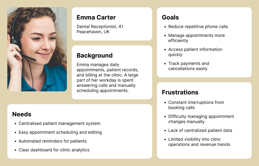
PERSONA #2: THE OVERLOADED RECEPTIONIST
Clinic receptionists are responsible for managing appointments, patient records, and administrative tasks while constantly responding to phone calls. Much of their day is spent handling repetitive booking requests and manual scheduling, which increases workload and leaves little time for more important patient care tasks. Their biggest challenge is keeping clinic operations organised while reducing interruptions and administrative overhead.
Feature Prioritisation
During the discovery phase, I identified a wide range of potential features for both the patient-facing app and the internal clinic system. However, implementing everything at once would increase development complexity and delay launch.
To ensure the product could deliver value quickly, I prioritised features using a Must-Have (MVP), Should-Have, and Future Enhancements framework. This helped focus on the most critical problems first while leaving room for future improvements.
Patient App
The main goal for patients was to simplify appointment booking and reduce phone calls. The MVP focused on scheduling and managing appointments, including first-time bookings, real-time availability, and online payments. Automated reminders minimized missed appointments, and patients could cancel, reschedule, or view past and upcoming visits.
Once the core booking experience was established, additional features were planned to enhance patient experience, such as viewing treatment plans, uploading insurance info, secure messaging, and virtual consultations.
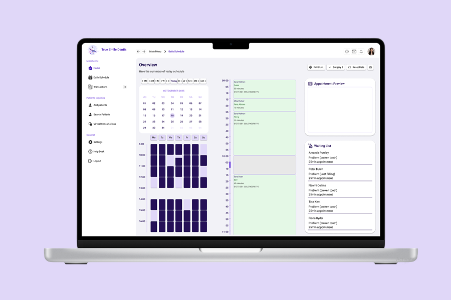
Staff CRM
The internal CRM aimed to improve clinic efficiency. Key features included accessing patient profiles, managing bookings, sending automated notifications, and tracking payments with analytics dashboards.
Future enhancements planned included role-based access, treatment tracking, digital consent forms, integrated billing/insurance claims, task management, and automated patient recalls.
By prioritizing features this way, the platform improved patient experience and staff workflow immediately, while remaining flexible for future growth.

Design Process
After defining the core features and priorities, the next step was to design a system that would support both patients booking appointments and clinic staff managing daily operations. The design process focused on simplifying complex workflows while ensuring the system remained intuitive for both user groups.
Userflow
Wireframe
UI Design
Testing
Iteration
User Flow
To better understand how users would interact with the system, I mapped the key journeys for both patients and clinic staff. Visualising these flows helped identify unnecessary steps in the existing phone-based process and guided the creation of a more streamlined digital experience.
Mapping these flows ensured that both users could accomplish their tasks efficiently while keeping the system simple and intuitive.
Patient
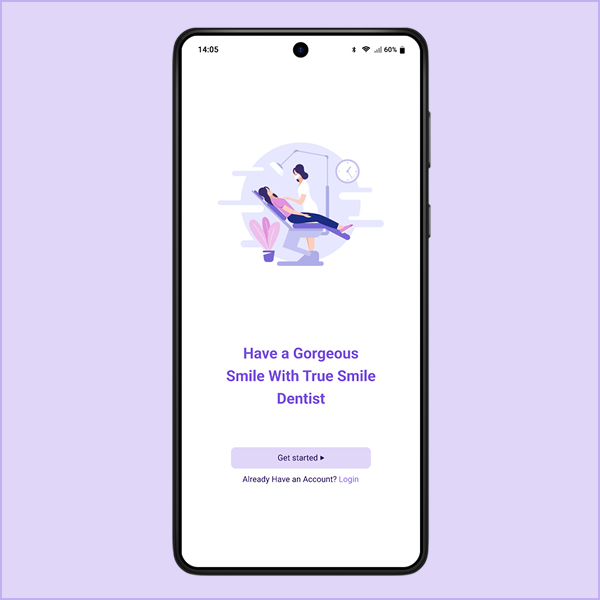
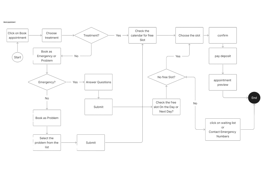
For patients, the primary journey focused on booking an appointment quickly and independently. The goal was to reduce friction by minimising the number of steps required while still providing clear information about appointment types, availability, and payment.
The flow begins with selecting a treatment type, followed by choosing an available time slot. Patients can then review their appointment details, complete the payment, and receive confirmation through automated notifications.
Staff
For clinic staff, the workflow focused on efficient appointment management and patient record access. Staff members can quickly search for patients, create or modify bookings, and manage communication through the CRM system. This reduces manual administrative work and centralises patient information in one place.
Wireframing
Once the core user flows were established, I began translating them into low-fidelity wireframes. The goal at this stage was to focus on structure, hierarchy, and usability rather than visual design.
Early wireframes explored different ways to simplify the booking process and reduce cognitive load for users. Several layouts were tested to determine how information such as appointment types, available time slots, and treatment details could be presented clearly.
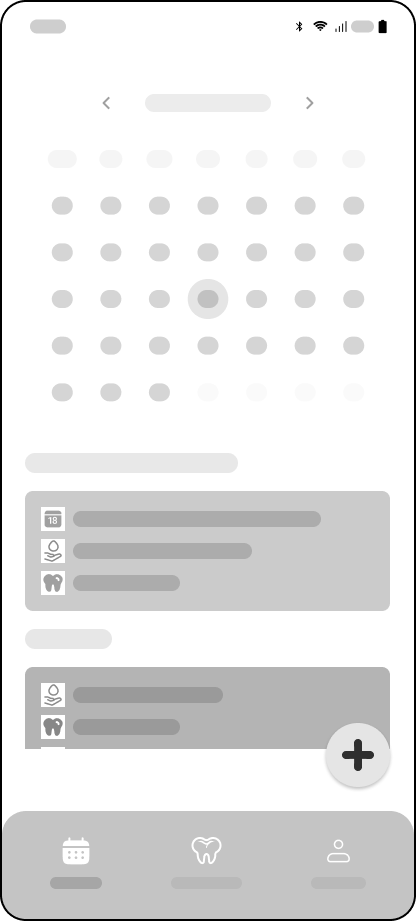
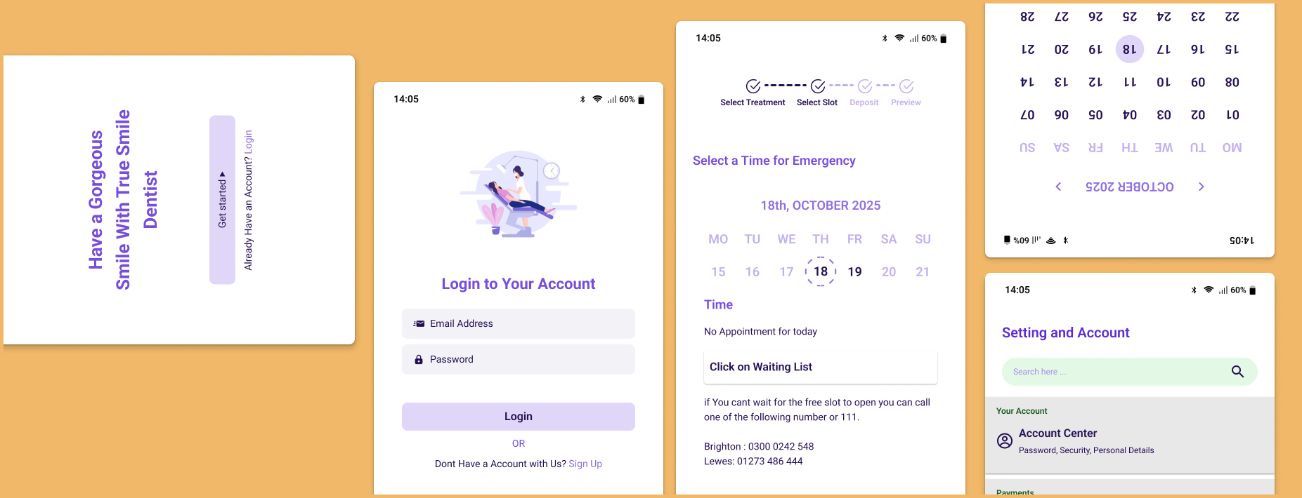
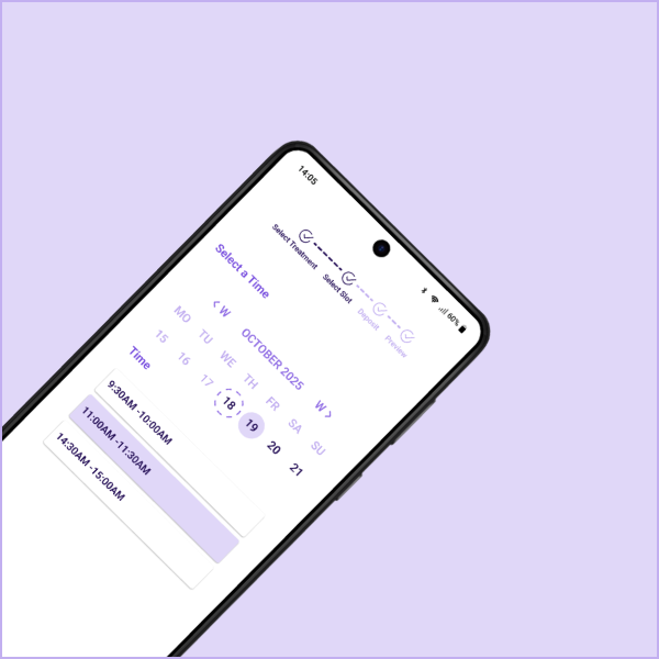
Main Page
Patients can view their upcoming appointments alongside appointments that still need to be scheduled. They can easily book a new appointment by tapping the Plus (+) button.
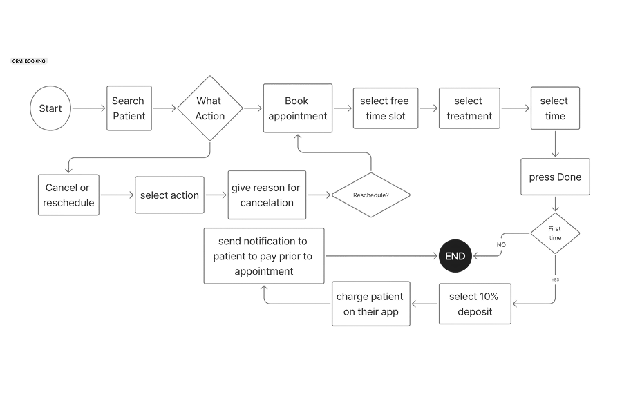
Booking
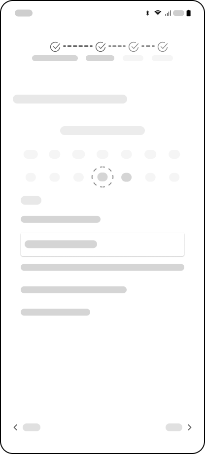
One key design decision was simplifying the booking journey into four steps: select a service, choose a time slot, review details, and confirm the appointment.
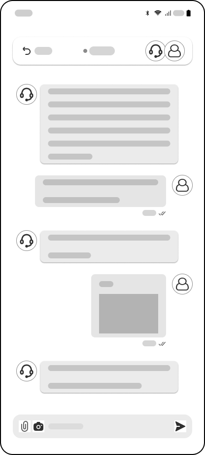
Online Chat
Patients can use online chat to contact staff for minor issues, such as infections, to request a prescription or have a quick 5-minute consultation to determine if they need to book a longer appointment.
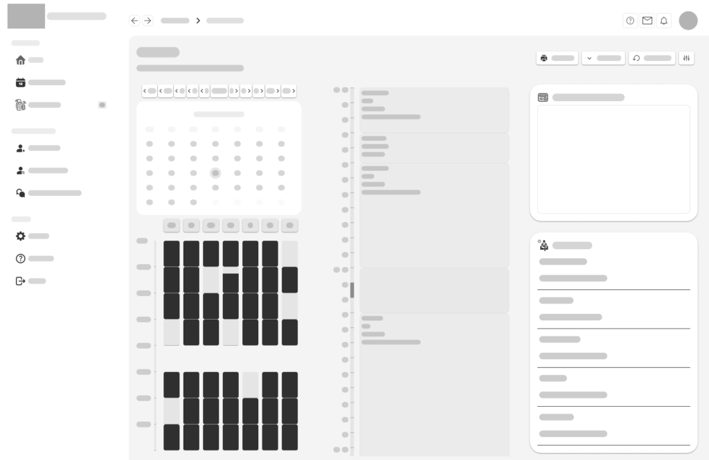
CRM Managin appointments
For the staff CRM, wireframes prioritised dashboard visibility and quick access to patient data. Key elements such as the appointment calendar, patient search, and financial tracking tools were organised to ensure staff could manage clinic operations efficiently.
UI Design
After validating the structure through wireframes, I moved on to high-fidelity designs to establish the visual language and brand identity of the product.
Since healthcare platforms must feel reliable and reassuring, the interface was designed to communicate cleanliness, trust, and professionalism. The visual style focuses on clarity and accessibility, ensuring patients of all ages can easily navigate the system.
Bulding the Brand


To create a cohesive experience across the mobile app, website, and CRM system, I developed a simple brand identity for the platform.
Colours and graphics aim to create a welcoming experience without overwhelming the interface.
Brand Name
True Smile Dentist
A visit to the dentist can often feel intimidating for many people. Because of this, the name True Smile Dentist was chosen to reflect a more reassuring and patient-focused approach to dental care.
The word “True” represents honesty, trust, and transparency — qualities that are essential when patients are making decisions about their health. “Smile” focuses on the emotional outcome of dental treatment: helping patients feel confident, comfortable, and happy with their smile.
Together, the name creates a brand that feels warm, trustworthy, and human, reinforcing the idea that the clinic is not just about procedures, but about helping people achieve smiles they can genuinely feel good about.
Usability Testing
To evaluate the effectiveness of the design, usability testing sessions were conducted with several participants who regularly interact with healthcare booking platforms.
Participants were asked to complete common tasks such as booking an appointment, rescheduling a visit, and locating treatment information. Observing how users interacted with the interface helped identify areas where the design could be improved.
Testing revealed that while the booking process was generally intuitive, some users wanted clearer confirmation before completing payments. Based on this feedback, a review summary screen was added before finalising the appointment.
During discussions with clinic staff, another important issue emerged. Staff explained that patients often book emergency appointments without providing enough information, which can create scheduling problems. For example, a patient might book a 15-minute emergency slot but actually require a 40-minute extraction procedure.
To address this, a short pre-appointment questionnaire was introduced for emergency bookings. This allows patients to briefly describe their symptoms and concerns, helping staff better understand the situation and allocate the appropriate appointment length in advance.
Additional adjustments were made to simplify form inputs and make treatment information easier to understand.
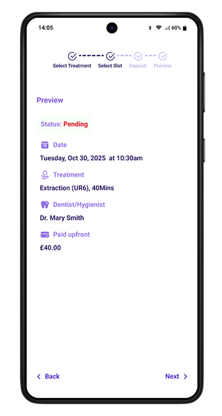
Review before paying the deposit
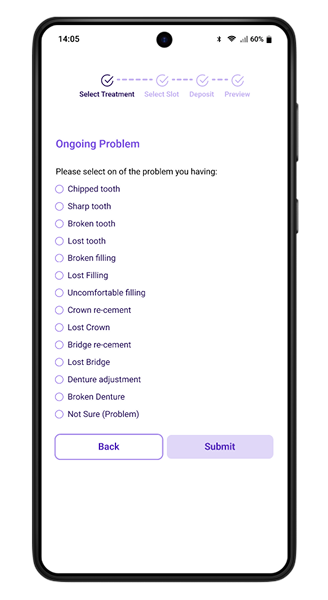
Problem appointment Questionnaire
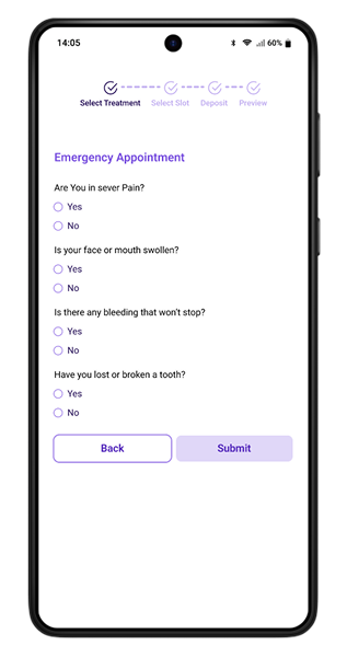
Emergency appointment Questionnaire
Iterations & Refinement
User testing revealed a few areas where the experience could be improved. By observing how both patients and staff interacted with the system, I introduced several refinements to make the process clearer and more efficient.
SIMPLIFYING APPOINTMENT FORMS
Some users hesitated when filling out booking forms. To reduce friction, unnecessary fields were removed and the remaining inputs were organised into a clearer step-by-step flow.
ADDING A BOOKING REVIEW SCREEN
Several participants wanted to confirm their details before completing payment. A summary review screen was added so users can double-check the appointment type, date, and cost before finalising the booking.
EMERGENCY APPOINTMENT QUESTIONNAIRE
Clinic staff noted that patients sometimes booked short emergency slots for treatments that required more time. A short pre-appointment questionnaire was introduced to help staff understand the issue and allocate the correct appointment length.
These changes helped create a smoother experience for patients while improving scheduling accuracy for clinic staff.
Takeaways
Designing the True Smile Dentist platform was an opportunity to explore how digital tools can simplify everyday healthcare interactions. The goal of this project was not just to design a booking app, but to rethink how patients and clinic staff interact with a dental practice through a connected system of a mobile app, website, and staff CRM.
Throughout the process, it became clear that simplicity is essential in healthcare products. Patients want to book appointments quickly and understand their treatment without confusion, while staff need tools that help them manage schedules, payments, and patient records efficiently. Balancing these two needs shaped many of the design decisions.
If the project were to continue, there are several areas that could be explored further, such as deeper insurance integrations, automated treatment reminders, and expanded analytics tools for clinic management. Additional usability testing with a wider range of patients and clinic staff would also help refine the experience even more.
Overall, this project highlights how thoughtful design can reduce administrative workload while creating a more convenient and transparent experience for patients.